
A Sensory Portrait: Color & Texture in The Mimosa Tree
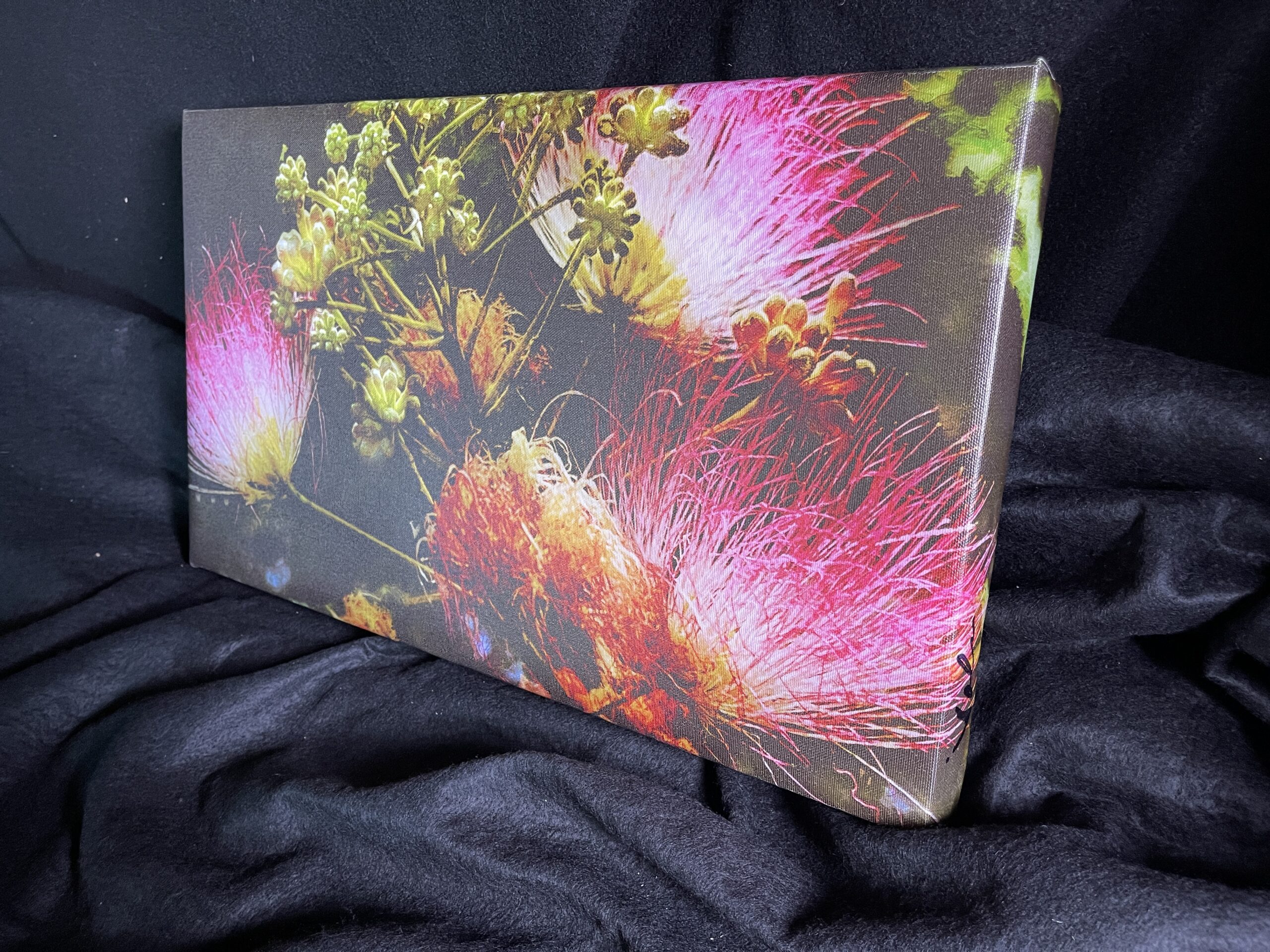
At its core, Michael John Valentine’s 11.5 x 20 Abstract The Mimosa Tree is not simply decorative — it is a visual dialogue between pigment, surface, and perception. While abstract in form, the work carries an evocative energy rooted in the suggestion of organic life: the airy bloom, the sunlit dance of leaves, the pulse of natural growth rendered through expressive means.
I. The Palette: Warmth Lifted by Contrast
Valentine’s color choices rise from a sensibility attuned to both emotional resonance and visual balance. In The Mimosa Tree, the palette hinges on warm, radiant hues — tones that summon light and vitality without resorting to literalism. Yellow’s presence, often associated with the mimosa bloom’s botanical brightness (a hue celebrated for optimism and imagination in color theory) infuses the work with a sense of sun-lit warmth.
-
Primary Warmth: Dominant yellows and golds glide across the canvas like rays of filtered sun. These are not flat or uniform but vary in intensity — from pale lemon whispers to richer amber glows — suggesting the flicker of light through foliage.
-
Lush Accents: Interwoven with these golden swaths are muted greens and earth tones. The greens do not mimic leaves in a literal botanical study — instead, they evoke a memory of foliage, grounding the composition in organic suggestion while retaining abstraction.
-
Counterbalance & Depth: Shadows and cooler tones occasionally surface — earthy siennas, deep olives, perhaps even traces of subdued teal or umber. These darker accents temper the warmth, creating dimensional contrast that makes the brighter segments visually radiate.
This interplay between warmth and restraint ensures the viewer’s eye moves rhythmically across the canvas, never settling in one spot for too long. Rather than depicting a tree, Valentine evokes the feeling of growth and flux — a luminous memory, not a botanical diagram.
II. Texture as an Experiential Surface
From the moment light hits the surface of this gallery-wrapped canvas, texture becomes an integral part of the experience. The work isn’t flat; it’s tactile in spirit — something to be felt with the eye and the memory of touch.
-
Overpainting & Layering: Valentine’s work incorporates an overpainting method that builds surface depth and variation. This technique — layering pigment, then subtly refining and reworking — yields a field where colors interweave within varying degrees of thickness and translucency.
-
Tactile Undercurrents: In certain areas, the paint rises — a whisper of relief against smoother expanses. These textural peaks catch light differently throughout the day, creating a shifting sense of motion across the canvas. Shadows nestle into recesses while highlights bloom from raised trails of pigment, turning static observation into an active sensory exchange.
-
Directional Tactility: Though abstract, directional marks — whether long, feathered sweeps or compact stippled touches — suggest the rhythmic flutter of leaves or the organic growth of branches. These gestures are not illustrative but itself become the subject: motion, breath, and life compressed into surface rhythm.
This sculptural surface presence invites prolonged viewing. As the light changes in a room, these textural variations animate the work, rewarding the collector with a constantly evolving visual conversation.
III. Spatial Dynamics: Between Form and Gesture
One of Valentine’s subtle achievements in The Mimosa Tree lies in how he orchestrates spatial tension without traditional perspectival cues. The color and texture together create a luminous field — a picture space that feels open and breathing rather than confined.
-
Floating Hues: Blocks of warmth seem to hover, not pressed against a rigid background. This effect is achieved through a nuanced understanding of color interactions: a bright yellow next to a softened sienna echoes the natural light under a canopy, while a diffused green whisper grounds the composition without anchoring it literally.
-
Negative Space as Breath: The non-painted or less saturated areas act as visual pauses, giving gravity to the painted gestures and preventing the composition from feeling congested. This use of negative space amplifies both the textural richness and the expressive color juxtapositions.
-
Organic Motion: Abstraction here isn’t chaos but controlled improvisation. Valentine’s brushwork — sometimes swift, sometimes contemplative — hints at growth patterns, fleeting breezes, or the spatial weave of a natural scene. The result is a composition that’s lively without being loud, contemplative without being stagnant.
IV. Emotional and Aesthetic Resonance
Collectors drawn to expressive abstract art understand that such works often resonate beyond the literal. In The Mimosa Tree, the chosen color dynamics and textured surface gesture toward emotional states: hope, renewal, and quiet luminosity.
-
Yellow as Joy: Psychologically, yellow hues often relate to light, optimism, and mental energy. In the context of Valentine’s canvas, the yellows feel earned — they do not overwhelm but elevate, creating an ambient glow that suggests sunrise or dappled afternoon light.
-
Contrast as Contemplation: Where warm tones meet muted greens or subtle shadows, there’s a tension that invites reflection. It’s the sensation of beauty felt not just immediately but upon deeper visual engagement — a hallmark of fine collector work.
-
Texture as Memory: The tactile surface becomes a metaphor for lived experience — layered, complex, and resonant. Each textured ridge, each layer of overpaint reflects both intentional action and the history of the artist’s hand.
V. Context Within Valentine’s Practice
Understanding this piece in relation to Valentine’s broader body of abstract work enhances appreciation of its color and texture. Across his abstracts, he consistently uses layering, gestural mark-making, and luminously balanced palettes to evoke mood and spatial energy rather than literal representation.
The Mimosa Tree stands as part of this continuum — a compact but richly articulated demonstration of how color and texture can convey memory of experience rather than mere appearance.
Closing Thoughts
The Mimosa Tree is less a depiction of flora and more a sensory exploration of light, warmth, and movement on canvas. Its palette feels like sunlit breath; its textures invite both visual and emotional engagement. The result is a work that transcends decoration — it is a living surface, reflective of an artist’s lifetime of technique and expressive intent.
