
“Color is a power which directly influences the soul.” — Wassily Kandinsky
Psychology of Colors
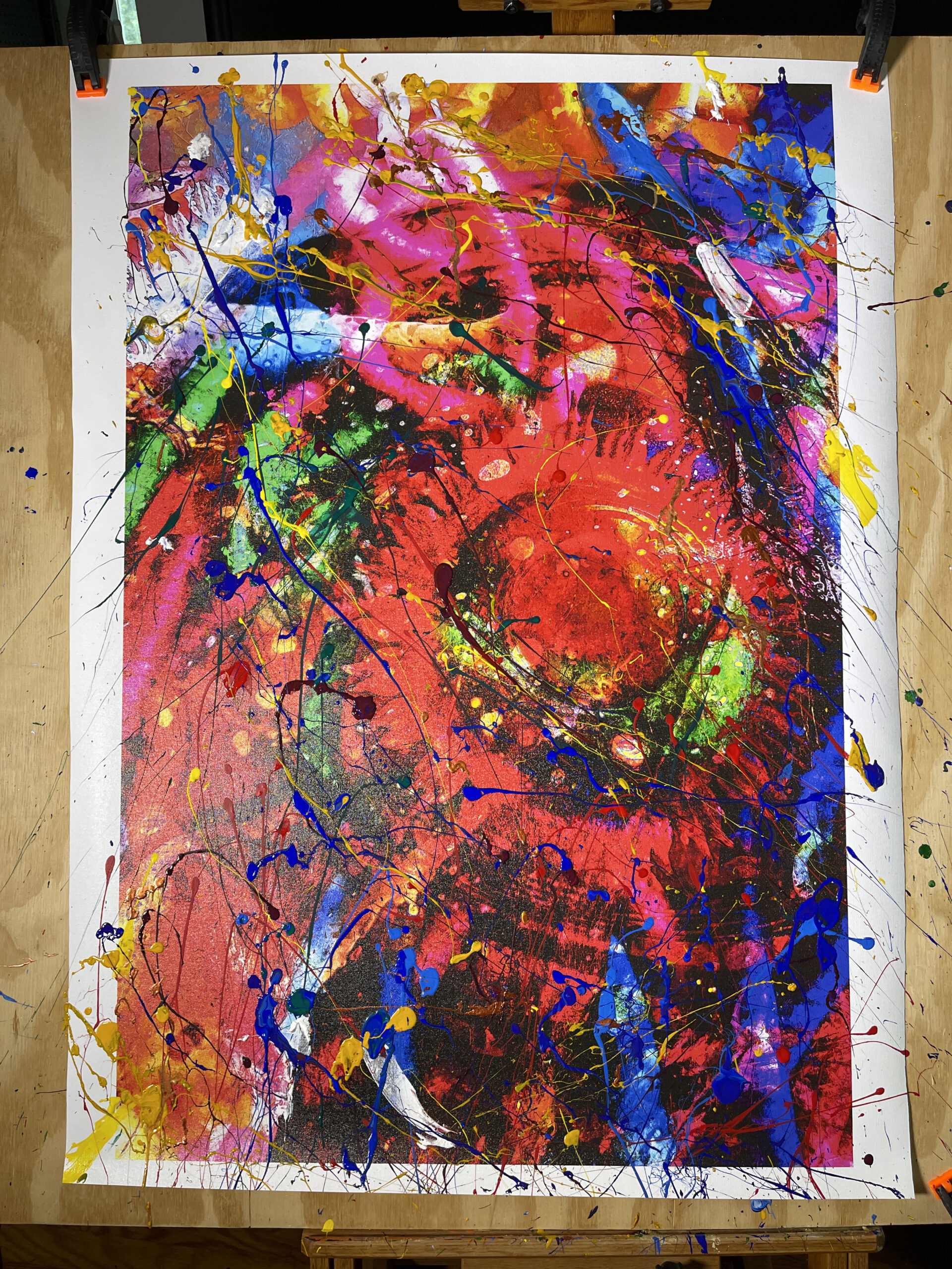
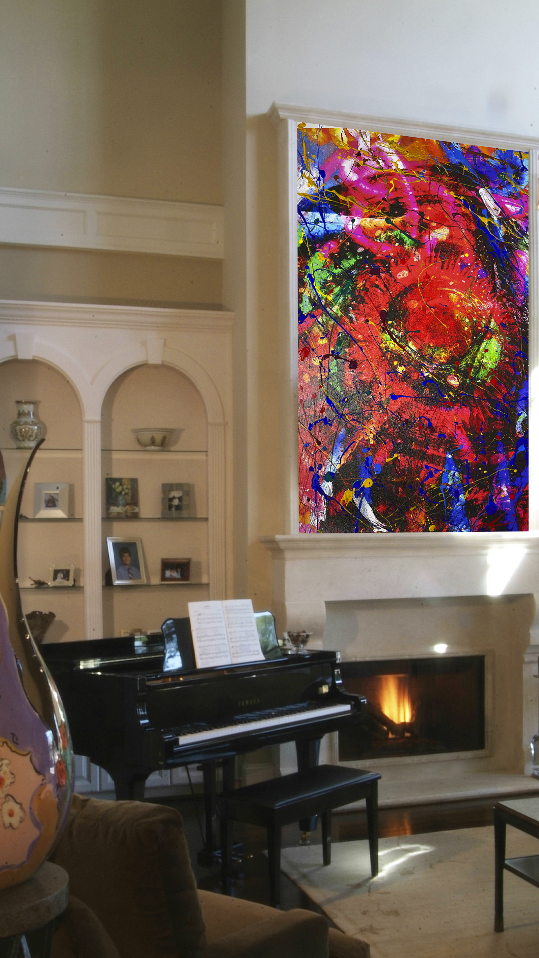
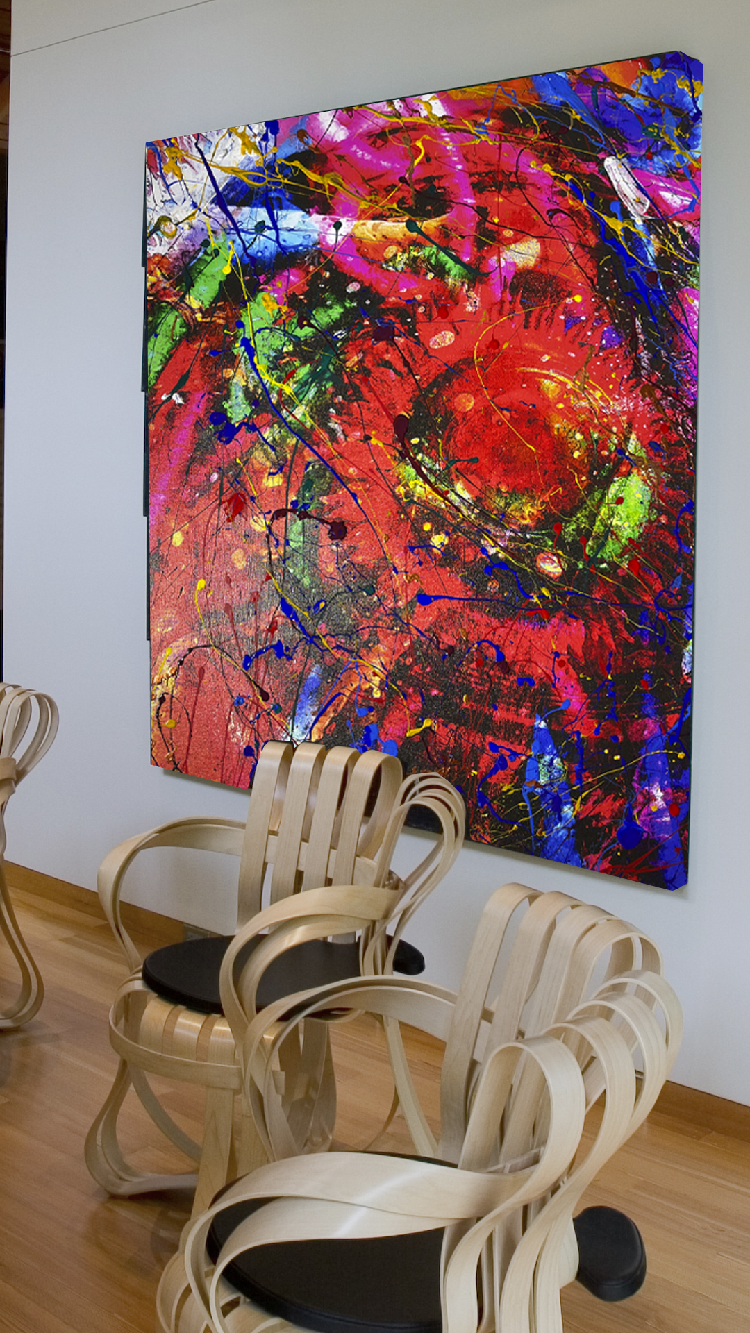
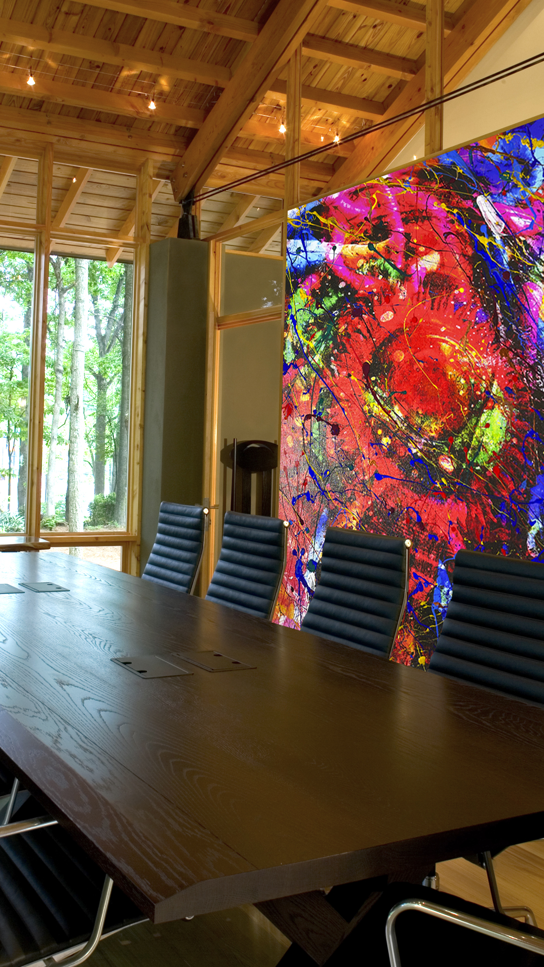
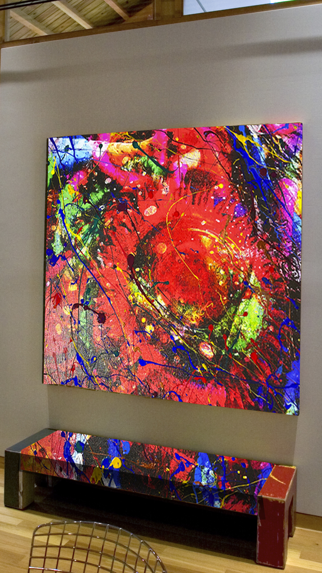
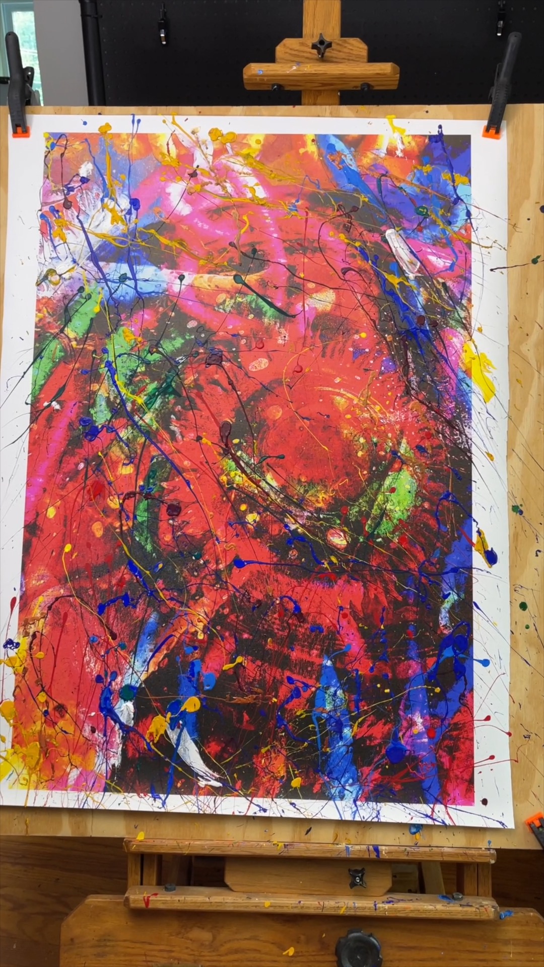
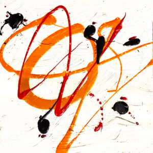
Original Abstract Acrylic on Canvas by Michael John Valentine
28″ × 42″ — A Collector’s Vision –One of One
In Psychology of Colors, Michael John Valentine offers more than an abstract composition; he presents a visceral experience driven by the intricate interplay of hue, form, and emotional resonance. This original acrylic on canvas—rich in gesture, layered with expressive energy, and sealed for permanence—stands as a testament to Valentine’s mastery of color psychology and abstract sensibility.
A Palette Tuned to the Psyche
From early in his artistic journey—beginning formal art training at age ten and continuing through a lifetime of photographic and painterly exploration—Valentine has approached painting with an intuitive understanding that color transcends mere visual description. Psychology of Colors embodies this philosophy, coaxing viewers into a dialogue with their own emotional landscapes.
Where representational art anchors itself in the recognizable, Valentine’s abstract language liberates color from narrative constraints. Instead, each tone, saturation, and contrast functions as a psychological trigger. Here, vibrant stripes might evoke exhilaration; deeper, tempered hues could incite introspection. Like Kandinsky suggested, color in abstraction doesn’t merely decorate—it vibrates through the soul, eliciting reactions beyond the limits of words.
Structure Without Form, Emotion Without Words
At first glance, Psychology of Colors may seem unbounded—free from recognizable motifs or figurative structure. But this perceived openness is deliberate: the absence of literal depiction invites the viewer to become co-creator of meaning. The canvas functions as a mirror, reflecting subjective states of mind back to the observer. This dynamic aligns with abstract art’s fundamental principle that form and color can communicate what cannot be articulated through narrative or symbol alone.
Valentine’s process begins with his own photographic work, weaving together layers of memory, observed light, and travel impressions before translating them into painterly abstraction. The result is a chromatic architecture replete with subtle chaos, balance, disruption, and harmony—an emotional topography rather than a physical scene.
Technique: Breath and Movement
Constructed through layered acrylics, palette knife gestures, and refined brushwork, the surface of Psychology of Colors lives in tension between control and spontaneity. Valentine’s choice of acrylics—favoring their quicker drying time and bold pigment retention—ensures that each interaction of color remains vibrant and perceptible. The glossy protective sealant arrests these hues in a state of perpetual luminosity, inviting prolonged engagement.
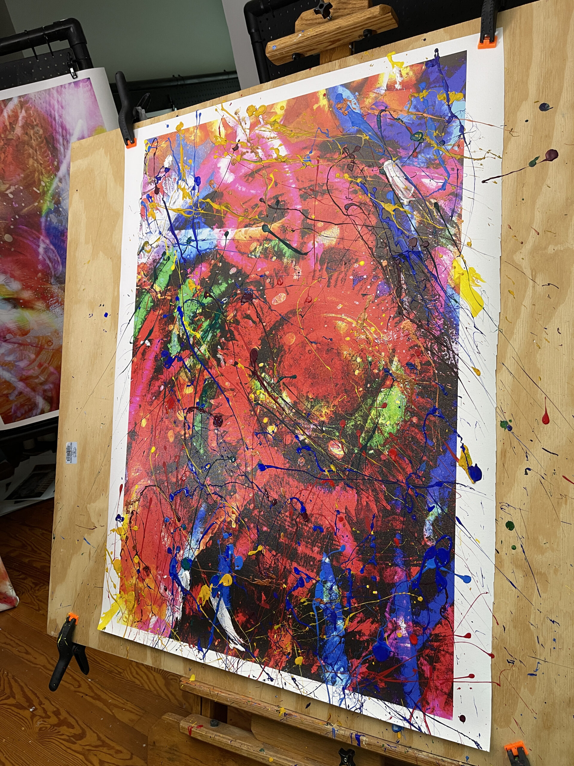
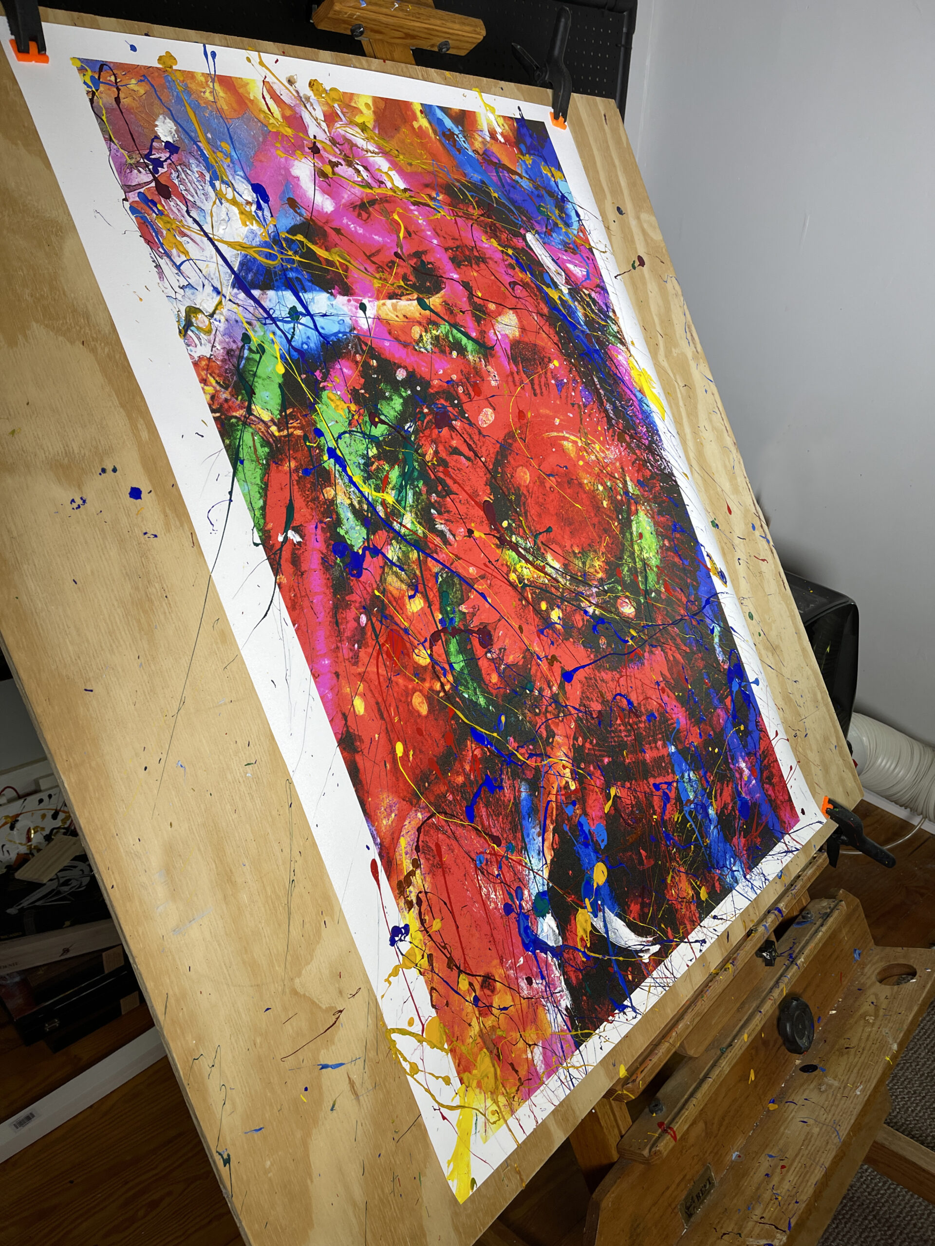
Delivered unstretched and rolled in a protective tube, this piece prioritizes both preservation and custom installation. It awaits the discerning collector’s choice of framing—whether stretched for modern minimalism or set within a bespoke architectural ensemble.
Color Psychology in Practice
The title itself—Psychology of Colors—signals Valentine’s intention: this work isn’t merely seen, it’s felt. Contemporary research in the field of visual perception supports the idea that colors bear intrinsic emotional associations. Studies show that specific hues can correlate with emotional states such as tranquility, excitement, or contemplation, illuminating why certain abstract canvases resonate so deeply within the psyche.
Where representational art evokes mood through subject, Valentine evokes mood through the direct emotional currency of color. This is abstract art at its most potent: an unmediated exchange between pigment and sentiment.
Aesthetic and Philosophical Legacy
Valentine’s Psychology of Colors resides within a lineage of abstract art that considers color as both subject and essence. From Wassily Kandinsky’s belief in color’s spiritual resonance to Josef Albers’s theories on perceptual experience and chromatic interaction, artists have long explored how color shapes human consciousness. Kandinsky, for instance, described color as a force with the capacity to influence the soul directly—a principle vividly realized in Valentine’s own layered chromatic expressions.
Collector’s Experience
This painting is not merely a visual acquisition; it is an investment in emotional resonance and intellectual depth. It arrives with a Certificate of Authenticity and the promise of a singular aesthetic presence in any collection. Its scale—28″ × 42″—grants it a commanding presence without overwhelming the space, making it ideal for environments where contemplative engagement is welcomed.
Collectors drawn to abstraction understand that such works are not static decorations but living presences. They shift with light, season, and mood; they reveal nuances under prolonged viewing that a single glance cannot disclose.
Conclusion: An Invitation to Perceive
Psychology of Colors is a painting that exists between perception and feeling. Its true subject is not a scene, object, or story—it is the human capacity to respond. Through an orchestration of hue, texture, and spatial dialogue, Michael John Valentine extends an invitation: to see with receptive eyes, to reflect with open heart, and to feel the psychological echoes that color alone can ignite.
This is abstract art not as visual ornament, but as experiential encounter—a realm where color becomes language, emotion becomes form, and the viewer becomes part of the creative continuum.
Titled- Psychology Of Colors
One in studio