


“Every perception of colour is an illusion…. we do not see colors as they really are.”
— Josef Albers
from his teachings on color perception, Homage to the Square series
This profound insight by one of the 20th century’s great color theorists becomes a lens through which we can enter Blue Harmony Abstract Fine Art — a painting that does not merely display color, but re-imagines how color feels, moves, and speaks.
Blue Harmony Abstract Fine Art
By Michael John Valentine — Fine Art that resonates with harmony, depth, and collected intention
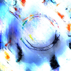
Blue Harmony Abstract Fine Art is more than a visual experience — it is a dialogue between pigment and emotion, atmosphere and imagination. Through layered acrylics and nuanced brushwork, this abstract creation invites viewers into a space where color becomes a language in itself: an expressive force that carries rhythm, mood, and meaning without a single figurative line.
Michael John Valentine’s artistry — grounded in 55+ years of professional practice and formal training at Kent State University — embraces this complexity with sophistication. Each viewing reveals new subtleties, making Blue Harmonya piece that grows richer with time, gaze after gaze.
Color as the Conductor of Emotion
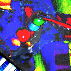
From the moment you encounter Blue Harmony, the interplay of deep cobalt blues, radiant crimsons, and glowing magentas captivates the senses. These are not merely hues on a surface. They are the emotional pitches and undertones of a composition that feels alive — as though the painting itself breathes with an inner cadence.
The work’s title, Blue Harmony, reflects its foundational spirit: harmony through contrast, connection through color. The calm majesty of blue anchors the piece, while bold accents ripple through it, leading the viewer’s eye in dynamic arcs and subtle pauses. Hints of light and shadow drift across the canvas, evoking impressions that feel at once aquatic, atmospheric, and cosmic.
In the world of abstract fine art, the choices an artist makes — in tone, saturation, intensity — are the equivalent of a composer’s in music. Valentine’s use of blues touches a universal resonance: cool serenity paired with an undercurrent of mystery and introspection; crimson accents that lend warmth without overwhelming; magentas that bridge emotion and energy.
Painting Beyond Representation
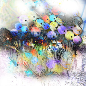
Unlike art that depicts forms or figures, Blue Harmony exists in the realm of pure perception. There are no prescribed shapes — only an invitation to feel, to sense, to respond. This direct engagement with color harks back to the vision of artists like Albers: that color itself, freed from form, becomes a conduit for sensation and revelation.
Here, form dissolves into fluid movement. Brushstrokes are gestures, not boundaries — layering with precision and intuition so that texture itself becomes part of the narrative. In areas of deeper pigment, the viewer might sense an almost orchestral resonance; where hues lighten and blend, a quiet lyricism appears.
The tactile quality of the surface — built up through acrylic layering and glazing — enriches this language further. Light dances on and within the paint, allowing reflections and shadows to shift with perspective. It is this kinetic subtlety that animates Blue Harmony and positions it as a work not just seen, but experienced.
A Collector’s Reflection: Time, Presence, and Atmosphere
Collectors often speak of works that live in a space — paintings that produce a presence beyond their physical dimensions. Blue Harmony possesses this quality. Whether displayed in a refined private collection, an executive office, or a modern gallery, it becomes an atmospheric anchor: a visual environment that invites pause, reflection, and engagement.
The piece’s emotional depth lends itself to moments of quiet contemplation, while its vibrant energy can uplift and invigorate. This dual capacity — to soothe and to spark — makes Blue Harmony uniquely versatile, bridging personal introspection and shared experiential impact.
Moreover, Valentine’s meticulous hand — rooted in decades of craft and a lifelong dedication to abstraction — ensures that this work is not derivative but original. His process melds traditional painting techniques with intuitive composition, inviting an organic harmony that feels both timeless and alive.
The Art of Seeing: A Personal Invitation
Albers’ observation that color is an illusion underscores one of the greatest gifts of abstract art: the realization that what we see is shaped by perception — by feeling, memory, mood, and subtle shifts of light. When one stands before Blue Harmony, color ceases to be static. It becomes a mirror for experience.
This is the invitation Valentine extends to every viewer: come not to understand in a literal sense, but to engage in a personal, emotional dialogue. Allow the blues to resonate. Let the contrasting tones stir something within. Notice how your perception changes with each angle, each passing moment of light.
In this way, Blue Harmony Abstract Fine Art becomes more than a painting. It becomes an evolving encounter between viewer and canvas — a conversation of color that reveals as much about the observer as it does about the artwork itself.
Conclusion
Blue Harmony Abstract Fine Art is a masterful expression of color’s capacity to evoke, resonate, and transform. It stands firmly within the legacy of visionary abstraction, where color is not an accessory but a primary voice — a medium through which emotion, rhythm, and spirit communicate directly to the soul.
In a marketplace filled with images, few works transcend representation to become experiences. Blue Harmony is one of them. It is a fine art piece that beckons viewers not just to look, but to feel, embodying an artistic ethos rooted in depth, harmony, and perceptual wonder.
The Exhibition Canvas comes in 3 sizes and goes through several steps that include overpainting with acrylics, signing with acrylics on the front and a final glazing to protect the canvas before being rolled in a sealed tube then a box ( shipping is free in the USA )
The Matted Prints come in 3 sizes and are shipped in a box. ( shipping and handling is free in the US)
The Glossy Poster Print measures 16 x 24 and arrives in a sealed tube that is placed in a box. ( shipping is free in the US )
The 4 Inch Round Peel And Stick Decal is perfect for many applications beyond cars and comes in a sealed envelope ( shipped for free )
